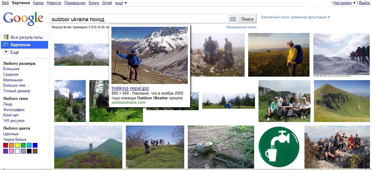
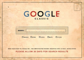
 Yesterday all evening I was the witness of Google experiment. Instead of the usual interface of Google Images search results (Google Images), I was “showed” an experimental version – large images without captions, divided into pages.If you hover over the image, a pop-up window appears with an enlarged image, caption, size, and a link to the source. This version of the image search interface somehow reminded me of the style of Google Picasa. On click, a modal window was opened with an even larger frame, and the page of the image source site was loaded in the background.I thought that it would always be like this and tried to get used to the new look, but today everything is back to normal. Familiar signatures and small pictures. Apparently, I became one of the randomly selected participants in the Google experiment. Or was it like that for everyone?Finally, I publish a Google postcard. Free fantasy, on the topic “What would a search engine look like in the pre-computer era?”. And how did people live without the Internet?P.S. Too bad I didn’t make a printscreen of the experimental interface. Suddenly it will never be launched, I will not see it again (screams and sobs, I sprinkle ashes on my head).P.P.S. Before I had time to sleep properly, Google again showed me a “fresh” version of Funny Pictures. Urgent printscreen. Hooray!Damn, but I didn’t take a picture of the old Google Images interface, which I loved so much, I didn’t keep it as a keepsake. Ashes, ashes for me!
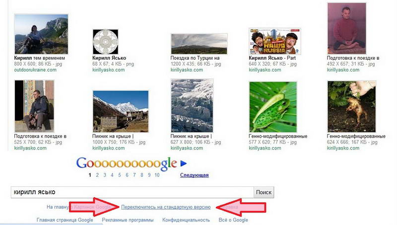
 P.P.P.S. And that’s not all (you have to add an article every half an hour)!There were no combustion products of the required quality at hand, but we managed to find a way to switch between the old and new versions of the interface. At the very bottom of the page, under the duplicate search bar, there is a link “Switch to the simplified version”. Google called the classic version of the interface a simplified version, and the remake has already become Standard version (see photo below).

